BA3b: Overall Curation of Degree Show....
- Sarah Jane

- May 16, 2019
- 7 min read
We began curating the Degree Show through proposals almost 2 months ago. A lot has changed throughout the curation process, and most notably the works proposed. Having had a look around the spaces now that people have started to finish installing their final works, there are a lot of things that I wished we could have curated better having known what the final outcomes were going to be.
Firstly, with PS1 I felt that having Joel's massive paintings away from the staircase just didn't look right, I would have preferred these more spread out and the first thing you see as you come up the stairs. As it stands at this moment, the smaller end of PS1 is very painting heavy, and I think having the space between them would not only allow Joel's paintings to breath, but also Emilia's painting too as I feel it's being suffocated by the larger scale paintings. In terms of Georgia's Health and Safety sculptures, these would more effective either central in the space, or in Guntons, to allow for the bigger paintings to effectively use the space, and I feel the health and safety aspect of these sculptures would shine through more if they were in the centre of the space, blocking and changing people's path around the works.
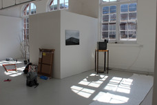
With PS2, it seems to be very sparse in terms of works, and there seems to be a lot of tv's along the same side, one being in a space with almost direct sunlight. I'm also not sure about the pieces that haven't put up either, which is a shame as I can't really get a good sense of the space until opening day, but nonetheless, I do think this space should have gotten more consideration. I think my work and Charlotte's work gives the space a strong entrance, I just don't the think the end of the corridor gives it an equally strong finish. I think Richard's piece could have worked better in Guntons, and perhaps some of the more photographic pieces should have been displayed along PS2. PS2 is a tricky space to curate as well as PS4 as they are both corridors and are more suitable with 2D works rather than 3D works.
For the first floor studios, I like how they look visually, I think the colours are balanced and the ratio to 3D and 2D is also balanced. In SG44a the colours in Louisa's works effectively with Jiji's large scale colour paintings and mannequins. Cameron's landscape oil paintings work well with the Boat that Jake as placed in the space. In regards to the Boat, we were initially unaware of scale, but after seeing it in person, it wasn't as big as we were expecting, and in the end worked well with the Brexit themes seen within Louisa's textile painting piece as well. Sharon's piece has changed slightly since her proposal, with her doing less prints than anticipated, but overall I think the more neutral tones contrast nicely with the bright, bold colours of Louisa's and Jij's.
In SG44b, near the bay window, this area is probably one of the most successful areas of the show so far, with all the works working together effectively. The theme of the delicate, natural and old can be seen in all of the works, with Emily's bath, Maisie's photographs and Helen's glass vitrine of paper cutlery. The only part I have trouble with is Reece's large scale painting. I think the loudness and harshness of the painting contrasts really strongly with the delicate nature of the pieces in this corner, and although this could be a good thing, I do think something that straddles the line between both loud and natural would have worked better as a transition piece from this walkway to the bay window area.
Finally, SG44 looks really strong in terms of the curation of the works, with the right balance of colour, medium and space. There has had to be a slight move with Reece's piece as it was next to Sophie's large scale sculpture and Claude's trees, and because of this we felt that it would get swallowed up by these large pieces and needed it's own space, so perhaps this could be placed in PS2? Overall, I'm actually quite happy with how this space looks.
Upstairs in SG62, this space originally had Bethany's large scale framed room in the centre, along with a lot of bold, brightly coloured wall pieces. Me and Beth did discuss in length that this space wouldn't be suitable for it as it needed it's own space which I completely agreed with. We put it up initially in this room to just to see if it did work, and because Harriet's piece as a part that comes away from the wall, and the fact that it was quite close to Filip's we decided to try it at an angle, and then added the additional furniture that she wanted with it. This was slightly better, but didn't have the same effect as it did when it was not at an angle, and it quite clearly blocked a lot of Chloe's wall piece which for me is the highlight of the room. Although I understood the placement of Beth's work here - the link with architecture between hers and Chloe's, i did think it would have benefitted with the extra space in SG64. In the end, it was eventually moved, and Molly's textile pieces were moved in SG62 instead. This worked a lot better in terms of colour and style and I think both pieces now bring each room together.
Additionally, I do like how we have two metal pieces in SG62. I think these neutral pieces much like Sharon's downstairs, help to contrast and balance the colours and allow the room to not be too colour heavy on the eyes which is essential for public viewing as some people don't appreciate colour heavy artworks in the same room. I do think there needs to be a neutral element in these kinds of rooms whenever you're dealing with colour heavy works.
SG63 is looking really interesting and I think having a floor plinth this year really pushes the boundaries of what we can do with the spaces. I think that Rosie's projections on different objects is such a unique idea and nicely contrasts with the usual paintings surrounding it. It is also a nice break between two very big and busy rooms, where people can take a breather in this darkened space before moving onto the next larger scale room. There isn't much I would change in this room, and I think the simplicity of having a few paintings on the walls helps not to distract too much from Rosie's centre piece.
In terms of SG64, I do think that the added placement of Beth's sculpture works so much better in here, and works a lot better with the colour scheme in this room. This room isn't as bright as SG62 or SG44a, which I think isn't a bad thing. I also think having large scale paintings at the end as well as at the beginning of the show (Joel's in PS1) works really well and showcases the different styles of dramatic painting that we have come to develop as a year group. Perhaps Jack's masking tape wall sculpture could be potentially moved to Guntons as it doesn't really work aesthetically in the room, but other than that I think this room works cohesively and to what we initially curated.
For PS5 I'm really happy with how that looks, and I hope it is not overlooked as it's probably one of my favourite pieces. I was initially gutted that we decided on having Charlotte's table in PS5 as I felt that having it in PS1 would help bring that space together a lot more, but after seeing it in PS5 with the custom lighting, I realised that it wouldn't look as effective in the lighting of PS1 than it does here in PS5, so overall I'm happy with this placement. In regards to Courtney's cupcakes, I'm a little sad that there won't be as many as a wall full of cupcakes would have looked really effective, but I'm hopeful that it will still look as effective. It's interesting that she's been placed by the staircase on the way down to PS5, I think it's a good idea as it will draw people down to that room, but I hope it is okay to use that wall space as it is an original wall, and by a staircase so if any cupcakes fall it could potentially become a trip/slip hazard, but as long as they are secured this could potentially look really good and a potentially fresh new way of using that space.
Gunton's is a space that I'm still not 100% happy with in terms of curation and layout. Personally I think having the Stray Dog's 'room' blocks Iyesha's hanging sculpture and forces the viewer to walk around it. i also think there needs to be something else on the back wall to draw people to walk around this space as there is a lot of white space. This is sometimes a good thing, but could also be a potentially bad thing. In my experience of being in Retail and working with the Public I have an idea of what makes people want to walk towards something and if something is not eye catching, if there isn't much down a certain space people would be deterred from going down there. So there definitely needs to be something at the opposite end from the door to force people to walk down there.
In terms of the layout, I think there are too many walls in on the right side of Guntons. Things are hidden and people have to walk towards them to be able to properly view them. i think compared with St Georges, I have to say I prefer the openness of St Georges than the blocked off nature on this side of Guntons. The left side of Guntons looks a lot more open, and the placement of pieces work a lot better this side, but I do think this space could have been curated slightly better so each piece can be viewed properly but that is only my opinion. Perhaps once everything is up things will start to look a lot more inviting and it will come together.
Overall, I think this will be a good show, however there are certain elements that I would change since initially curating the show from proposals. I think there should have been a more indepth process to install which require the curation team to be able to look at the works made and curate them physically if needed to since some were different to what was proposed. I also think this would effectively bring more people in to install their work as it was disappointing to see how many people didn't turn up or turned up last minute to install works which makes it difficult to get a full sense of the show. Overall I think it will be a good show, and I hope once all of the works have been installed and some tweaked and potentially moved, it will start to come together.


Comments