Curation Team - Social Media Content...
- Sarah Jane

- Dec 13, 2018
- 5 min read
After meeting with Andrew and getting last minute graphics created and sent over, me and Sophie met up on the Friday 2 weeks before the show to discuss layouts and to start posting on social media.
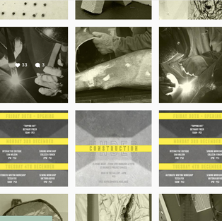
The content we had for the main instagram consisted of sneak peak shots of the artists studios, as well as images of the curators for a 'Meet the Curators' series, as well as the graphics that we had made. We had discussed a theme of the instagram, which involved all of the photographs being cropped down to the size of the instagram picture size, and then editing the colour to black and white with a hint of yellow which we got down to the NUA Yellow, again to keep in theme with the university without using any of the branding of the university. It also linked nicely with the black and white, with a hint of yellow colouring of the poster and all of the other graphics included in the advertising of the show.
We had previously decided on posting images in 3s, so it would look clean, professional and creative. Something that we hoped the show would also portray. We would work in photoshop to create blocks of nine that would be the layout of the feed when we upload them. This would be a form of digital curation, which I think is an important aspect of any advertisement or marketing campaign.
Once we had started to upload content for the instagram we went away, and Sophie worked on the advertisement of the show before it was up to gain publicity and excitement. She would schedule posts to go up and certain times and would use specific hashtags to increase clicks and visibility. I worked on uploading the 'Meet the Curator's' series of images, writing brief descriptions of each curator's practice and where to find them if they wanted to get more info about them.
I would then help out with the instagram stories which are short 5 second images in a series that help to advertise what we're doing, and they have an element of engagement in terms of being live updates, instead of the curated, edited images on the main feed. This section of the instagram is more fun and creative, and brings back the student essence of the show rather than a professional essence of the show which is demonstrated in the main content.
It also helps to build up an audience, and allows me to advertise any changes that we may have to do.
For added build up we also included a countdown to the show, which started a week before the show started. This was another attempt to build up excitement, and also fell in to our plan of posting in 3s, and in a way where everything falls into a coherent composition that looks curated. We made sure that the graphics matched with the theme of the show, black and white, with a hint of yellow. We also had photographs edited with the name of the artist and their workshop curated alongside the countdown to advertise our events as well. These looked really effective and professional, and worked really well with the image we had in mind for the instagram feed.
I then took over uploading once the show was open, and documented some of the pieces during install and created some graphics for the workshops. I decided to take close up shots of the works to force people to come down to the show to see the full pieces in person. I wanted to carry on with the theme of mystery and sneak peaks from the pre-show advertising. I took pictures of all the works in situ, uploaded them to our google drive, and then edited them in the same way we had previously' cropping them down, making them black and white, adding a hint of yellow and then saving them. I then uploaded them to the scheduling program that I was going to use and went through all of the pictures and selected the few that I thought looked really interesting and effective. There were quite a few that I didn't end up using in the end but the pictures I had selected I think were the best ones.
I tried to stick with posting in a grid or in 3s where possible, and tried to align the workshop graphics together so that it would all look coherent when we finished posting. For the last post on closing day, I decided to do something that was similar to what we did when we first started posting, I made a graphic that had the word CLOSED spread over three images, in a way blocking off that section of the instagram and allowing for a fresh start for the next show. I made it black and yellow, much like the 'Interim Show' banner when we first started, and I think this worked really well and allowed everything to fall back into place, just how we wanted it look.
Furthermore, for the captions we tried to be as encouraging as we could, and tried to persuade people to come down and see the show. I did think that Sophie's captions were a little too informal at times, although were quite effective at getting the point across. I felt that there was an overuse of punctuation, which I felt made the captions seem too friendly. For my captions, I tried to keep them formal, but also encouraging and interesting, keeping in mind the instagrams I had been looking at, and how they would advertise to their fans or onlookers.
We did also work in a facebook event page which was more formal and personal in terms of inviting friends and updating them on changes or events that were happening. We linked this in the instagram so people could look at a more detailed overview of the show.
Overall, this was a fun, but stressful experience and I think both me and Sophie worked really well together, organising the social media feed, discussing how to go about it, what to include, when to post and so on, and I feel like I have developed these skills a lot more from this. I do want to go into documentation perhaps in the next show as well as social media as I have been documenting works for a few people and I had forgotten how much I enjoyed it, and I would like more of a role in terms of pre-show advertising as I did feel like I didn't have much say in it, but overall, I'm happy with how things looked. I do wish that more people turned up to the events, and we could have done more in terms of advertising those events.


Comments